e-Commerce website
Helping Fika Pâtisserie owner increase E-commerce conversion by 11%
Helping Fika Pâtisserie owner increase
E-commerce conversion by 11%
Helping Fika Pâtisserie owner increase E-commerce conversion by 11%
YEAR
2023 (4 weeks)
2023
(4 weeks)
ROLE
UX Designer
UX Designer
focus
UX Research · E-commerce UX · Customer Journey Analysis · Conversion Optimization
UX Research · E-commerce UX · Customer Journey Analysis · Conversion Optimization
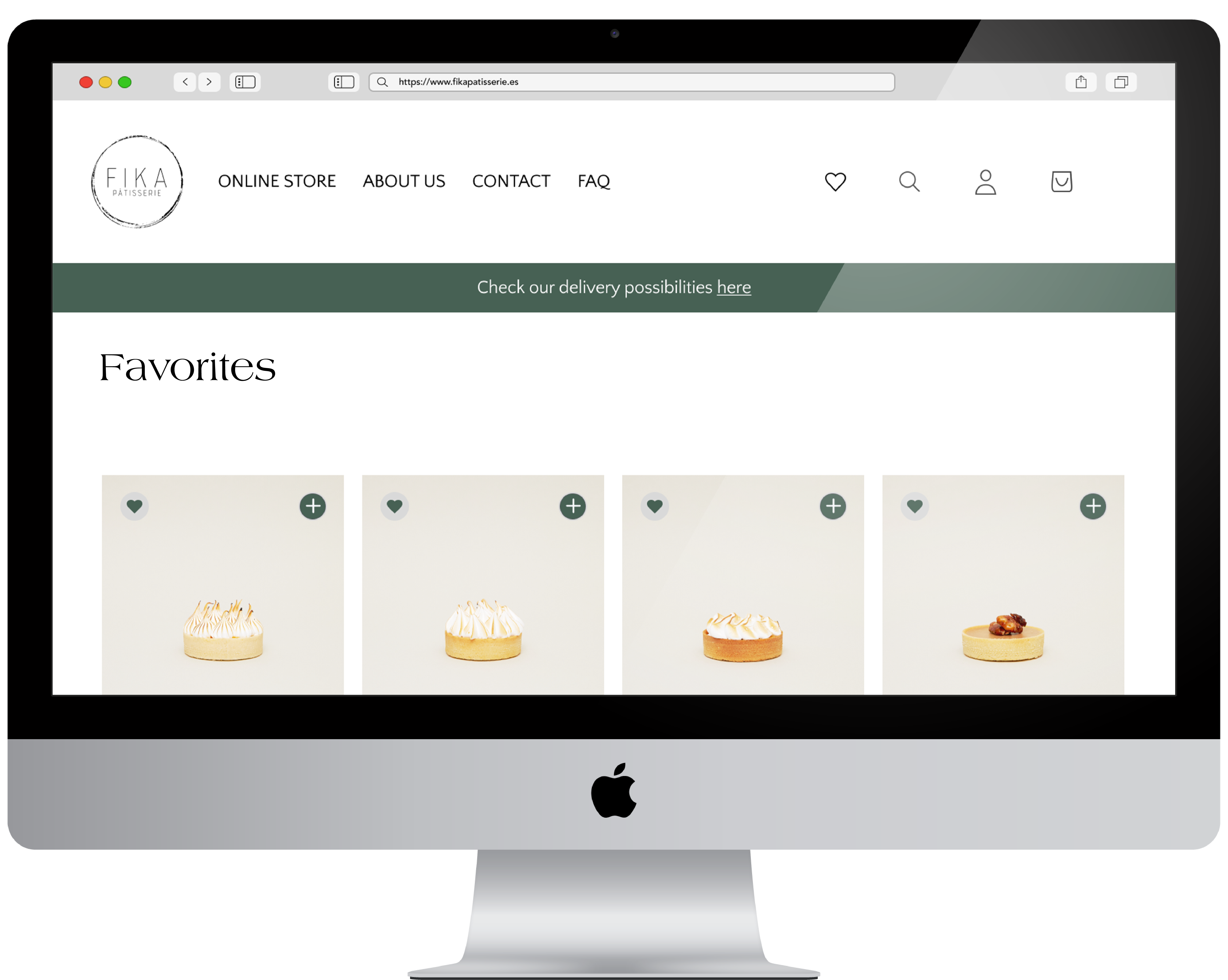
Project Overview
Project Overview
During my UX/UI bootcamp, I supported the founder of Fika Pâtisserie, a local French pastry and sweet store in Madrid, Spain. The brand combined French inspiration with handcrafted products, but its e-commerce experience was not converting as expected.
At the time of the project, the website had an average of 781 monthly visitors, generated around €400 in monthly online revenue, and had an average conversion rate of 0.61%. These numbers showed a clear opportunity to improve the purchase journey and understand where users were experiencing friction.
After the proposed UX improvements were implemented, the store observed an 11% increase in conversion during the following month.
During my UX/UI bootcamp, I supported the founder of Fika Pâtisserie, a local French pastry and sweet store in Madrid, Spain. The brand combined French inspiration with handcrafted products, but its e-commerce experience was not converting as expected.
At the time of the project, the website had an average of 781 monthly visitors, generated around €400 in monthly online revenue, and had an average conversion rate of 0.61%. These numbers showed a clear opportunity to improve the purchase journey and understand where users were experiencing friction.
After the proposed UX improvements were implemented, the store observed an 11% increase in conversion during the following month.
My Approach
I analysed where users were experiencing friction during the browsing and buying journey, focusing on navigation, product discovery, delivery transparency, payment options, and purchase continuity.
I analysed where users were experiencing friction during the browsing and buying journey, focusing on navigation, product discovery, delivery transparency, payment options, and purchase continuity.
Total Revenue
3491,90 €
Average Order Value
24,28 €
Process
BUSINESS PROBLEM
Users were interested, but the Buying Journey created friction
Users were interested, but the Buying Journey created friction
The business opportunity was to improve online conversion by understanding why users were visiting the website, browsing products, and showing purchase intent, but not completing purchases at the expected rate.
Google Analytics showed that the website had traffic, but conversion remained low. This created a clear opportunity to identify where users were losing confidence, dropping off, or facing unnecessary friction in the purchase journey.
The business opportunity was to improve online conversion by understanding why users were visiting the website, browsing products, and showing purchase intent, but not completing purchases at the expected rate.
Google Analytics showed that the website had traffic, but conversion remained low. This created a clear opportunity to identify where users were losing confidence, dropping off, or facing unnecessary friction in the purchase journey.
Business Priority
Improve online conversion by making the shopping experience clearer, more trustworthy, and easier to complete.
Improve online conversion by making the shopping experience clearer, more trustworthy, and easier to complete.
UX Challenge
Help users find products, understand delivery conditions, save products for later, and complete checkout with more confidence.
Help users find products, understand delivery conditions, save products for later, and complete checkout with more confidence.
DATA SIGNAL
Where the opportunity became visible
Where the opportunity became visible
The project started with available Google Analytics data and business-owner input. The goal was not to analyze every metric, but to identify signals that could explain why users were not completing purchases.
The project started with available Google Analytics data and business-owner input. The goal was not to analyze every metric, but to identify signals that could explain why users were not completing purchases.
Key signals
The website had around 15k sessions in the reviewed yearly period.
The baseline conversion rate was around 0.62%.
A significant share of traffic came from mobile.
Users showed interest in products, but the journey from browsing to purchase created friction.
The website had around 15k sessions in the reviewed yearly period.
The baseline conversion rate was around 0.62%.
A significant share of traffic came from mobile.
Users showed interest in products, but the journey from browsing to purchase created friction.
Sessions by device
+15.000 sessions (Values in %)
Switch between devices
Droped sessions (Values in %)
Payment methods
Unfinished sessions (Values in %)
Delivery zones
Unfinished sessions (Values in %)
Why this mattered?
The issue was not simply lack of traffic. The bigger opportunity was to understand what happened between product interest and completed purchase.
The issue was not simply lack of traffic. The bigger opportunity was to understand what happened between product interest and completed purchase.
RESEARCH
Understanding where customers lost confidence
Understanding where customers lost confidence
The research combined business-owner input, available analytics, user interviews, and live walk-through sessions.
The research combined business-owner input, available analytics, user interviews, and live walk-through sessions.
Stakeholder interview
I spoke with the business owner to understand business goals, customer behavior, operational constraints, and known purchase pain points.
I spoke with the business owner to understand business goals, customer behavior, operational constraints, and known purchase pain points.
Analytics review
I reviewed available website data to understand traffic, conversion, device behavior, product interest, and purchase patterns.
I reviewed available website data to understand traffic, conversion, device behavior, product interest, and purchase patterns.
User interviews + Live walk-throughs
Participants browsed the website while describing their thoughts and actions. This helped reveal hesitation, confusion, and moments where users needed more clarity.
Participants browsed the website while describing their thoughts and actions. This helped reveal hesitation, confusion, and moments where users needed more clarity.
Customer journey analysis
I mapped the path from product discovery to checkout to identify friction points in navigation, delivery information, payment, and purchase continuity.
I mapped the path from product discovery to checkout to identify friction points in navigation, delivery information, payment, and purchase continuity.
BEHAVIORAL ARCHETYPE

The Shopper who pauses and returns
The Shopper who pauses and returns
Behavior: Browses, compares, pauses, and returns later.
Need: Save products and continue the journey across sessions.
Opportunity: Favorites feature to support purchase continuity.
Behavior: Browses, compares, pauses, and returns later.
Need: Save products and continue the journey across sessions.
Opportunity: Favorites feature to support purchase continuity.

The Shopper who wants clarity at checkout
The Shopper who wants clarity at checkout
Behavior: Wants to buy, but hesitates when key information is unclear.
Need: Clear delivery, payment, and checkout conditions.
Opportunity: Delivery transparency and expanded payment options.
Behavior: Wants to buy, but hesitates when key information is unclear.
Need: Clear delivery, payment, and checkout conditions.
Opportunity: Delivery transparency and expanded payment options.
DEFINE
From findings to design opportunities
From findings to design opportunities
The research showed that the main challenge was not a lack of product interest, but a lack of clarity and continuity across the shopping journey.
The research showed that the main challenge was not a lack of product interest, but a lack of clarity and continuity across the shopping journey.
Cross-device behavior
Users often browsed on mobile but returned later or completed the purchase on another device.
Design opportunity: Introduce a Favorites feature to help users save products and continue their shopping journey later.
Users often browsed on mobile but returned later or completed the purchase on another device.
Design opportunity: Introduce a Favorites feature to help users save products and continue their shopping journey later.
Delivery uncertainty
Users needed to know earlier whether delivery was available in their area and how delivery timing worked.
Design opportunity: Make delivery zones and delivery expectations more visible before checkout.
Users needed to know earlier whether delivery was available in their area and how delivery timing worked.
Design opportunity: Make delivery zones and delivery expectations more visible before checkout.
Navigation complexity
The site structure made it harder for users to quickly find products and move through the experience.
Design opportunity: Simplify the site map and prioritize key content for product discovery.
The site structure made it harder for users to quickly find products and move through the experience.
Design opportunity: Simplify the site map and prioritize key content for product discovery.
Payment friction
At the time, the website offered limited payment options, which created friction at a critical checkout moment.
Business opportunity: Add more familiar payment options, such as card payment, to support checkout completion.
At the time, the website offered limited payment options, which created friction at a critical checkout moment.
Business opportunity: Add more familiar payment options, such as card payment, to support checkout completion.
DESIGN HYPOTHESIS
Supporting purchase continuity across devices
Supporting purchase continuity across devices
If users can save the product they searched on Mobile so they can easily locate them on desktop, they are less likely to forget and more likely to continue the purchase journey faster
This hypothesis led to designing of the "Favorites feature" because it directly addressed a recurring behavior observed during research: users browsing > comparing > pausing > and returning later to complete the purchase, meanwhile many users dropping after pause
If users can save the product they searched on Mobile so they can easily locate them on desktop, they are less likely to forget and more likely to continue the purchase journey faster
This hypothesis led to designing of the "Favorites feature" because it directly addressed a recurring behavior observed during research: users browsing > comparing > pausing > and returning later to complete the purchase, meanwhile many users dropping after pause
SOLUTIONS
Designing a smoother path from browsing to buying
Designing a smoother path from browsing to buying
The solution focused on helping users continue their purchase journey with less friction and more confidence.
The solution focused on helping users continue their purchase journey with less friction and more confidence.
introducing favorites
I designed a Favorites feature that lets users save products for later, supporting a seamless shopping journey across sessions and devices. By reducing friction in returning to previously viewed items, the feature encourages re-engagement and increases the likelihood of purchase completion.
Delivery Zone Transparency
Redesigning the delivery experience by surfacing delivery zone information earlier in the shopping journey. This helps users quickly understand service availability, reduces frustration caused by late-stage surprises, and creates a more transparent purchasing experience.

Site Map Improvements
Users needed a clearer way to navigate the platform and locate products without unnecessary effort. I restructured the site map to simplify navigation and prioritise key content, making product discovery faster and creating a more intuitive browsing experience.

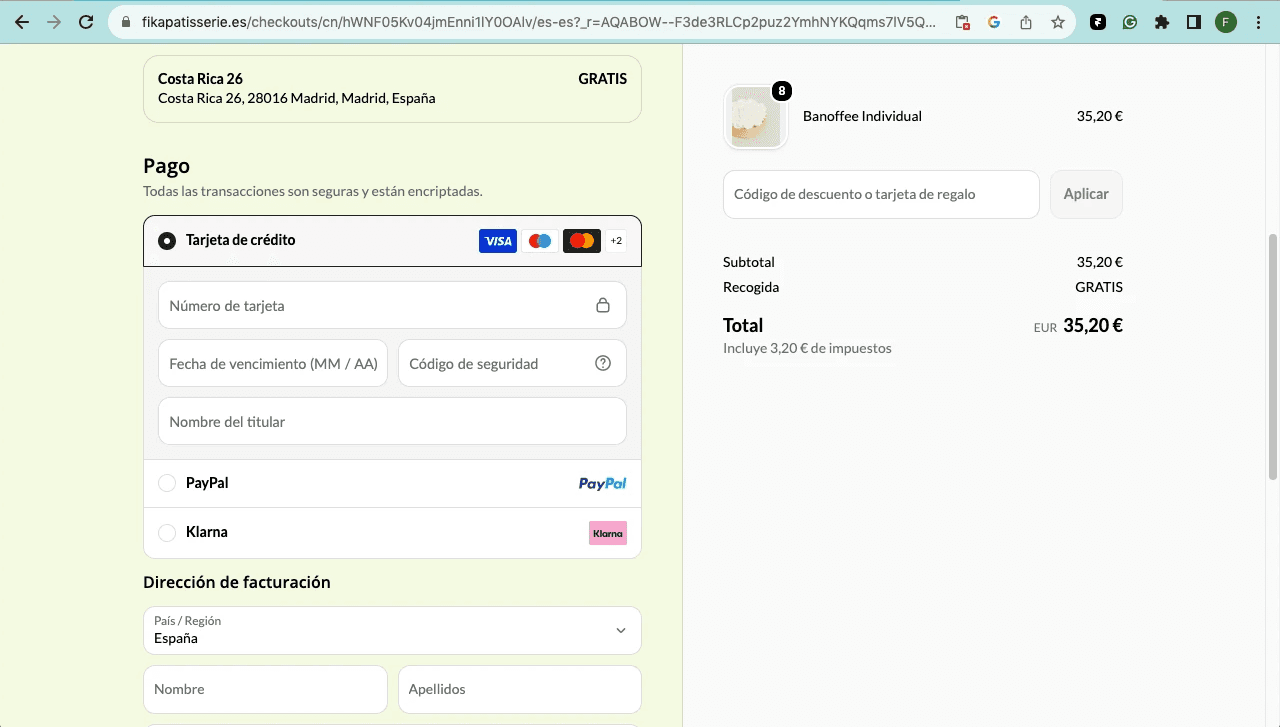
Payment method expansion
Identified the opportunity to expand payment methods to better align with user expectations and reduce checkout friction. Although this required business and technical implementation rather than a UI redesign, it represented a key product improvement to support conversion and create a more flexible payment experience.
introducing favorites
I designed a Favorites feature that lets users save products for later, supporting a seamless shopping journey across sessions and devices. By reducing friction in returning to previously viewed items, the feature encourages re-engagement and increases the likelihood of purchase completion.
Delivery Zone Transparency
Redesigning the delivery experience by surfacing delivery zone information earlier in the shopping journey. This helps users quickly understand service availability, reduces frustration caused by late-stage surprises, and creates a more transparent purchasing experience.
Site Map Improvements
Users needed a clearer way to navigate the platform and locate products without unnecessary effort. I restructured the site map to simplify navigation and prioritise key content, making product discovery faster and creating a more intuitive browsing experience.
Payment method expansion
Identified the opportunity to expand payment methods to better align with user expectations and reduce checkout friction. Although this required business and technical implementation rather than a UI redesign, it represented a key product improvement to support conversion and create a more flexible payment experience.
introducing favorites
I designed a Favorites feature that lets users save products for later, supporting a seamless shopping journey across sessions and devices. By reducing friction in returning to previously viewed items, the feature encourages re-engagement and increases the likelihood of purchase completion.
Delivery Zone Transparency
Redesigning the delivery experience by surfacing delivery zone information earlier in the shopping journey. This helps users quickly understand service availability, reduces frustration caused by late-stage surprises, and creates a more transparent purchasing experience.
Site Map Improvements
Users needed a clearer way to navigate the platform and locate products without unnecessary effort. I restructured the site map to simplify navigation and prioritise key content, making product discovery faster and creating a more intuitive browsing experience.
Payment method expansion
Identified the opportunity to expand payment methods to better align with user expectations and reduce checkout friction. Although this required business and technical implementation rather than a UI redesign, it represented a key product improvement to support conversion and create a more flexible payment experience.
introducing favorites
I designed a Favorites feature that lets users save products for later, supporting a seamless shopping journey across sessions and devices. By reducing friction in returning to previously viewed items, the feature encourages re-engagement and increases the likelihood of purchase completion.
Delivery Zone Transparency
Redesigning the delivery experience by surfacing delivery zone information earlier in the shopping journey. This helps users quickly understand service availability, reduces frustration caused by late-stage surprises, and creates a more transparent purchasing experience.
Site Map Improvements
Users needed a clearer way to navigate the platform and locate products without unnecessary effort. I restructured the site map to simplify navigation and prioritise key content, making product discovery faster and creating a more intuitive browsing experience.
Payment method expansion
Identified the opportunity to expand payment methods to better align with user expectations and reduce checkout friction. Although this required business and technical implementation rather than a UI redesign, it represented a key product improvement to support conversion and create a more flexible payment experience.
introducing favorites
I designed a Favorites feature that lets users save products for later, supporting a seamless shopping journey across sessions and devices. By reducing friction in returning to previously viewed items, the feature encourages re-engagement and increases the likelihood of purchase completion.
Delivery Zone Transparency
Redesigning the delivery experience by surfacing delivery zone information earlier in the shopping journey. This helps users quickly understand service availability, reduces frustration caused by late-stage surprises, and creates a more transparent purchasing experience.
Site Map Improvements
Users needed a clearer way to navigate the platform and locate products without unnecessary effort. I restructured the site map to simplify navigation and prioritise key content, making product discovery faster and creating a more intuitive browsing experience.
Payment method expansion
Identified the opportunity to expand payment methods to better align with user expectations and reduce checkout friction. Although this required business and technical implementation rather than a UI redesign, it represented a key product improvement to support conversion and create a more flexible payment experience.
introducing favorites
I designed a Favorites feature that lets users save products for later, supporting a seamless shopping journey across sessions and devices. By reducing friction in returning to previously viewed items, the feature encourages re-engagement and increases the likelihood of purchase completion.
Delivery Zone Transparency
Redesigning the delivery experience by surfacing delivery zone information earlier in the shopping journey. This helps users quickly understand service availability, reduces frustration caused by late-stage surprises, and creates a more transparent purchasing experience.
Site Map Improvements
Users needed a clearer way to navigate the platform and locate products without unnecessary effort. I restructured the site map to simplify navigation and prioritise key content, making product discovery faster and creating a more intuitive browsing experience.
Payment method expansion
Identified the opportunity to expand payment methods to better align with user expectations and reduce checkout friction. Although this required business and technical implementation rather than a UI redesign, it represented a key product improvement to support conversion and create a more flexible payment experience.
introducing favorites
I designed a Favorites feature that lets users save products for later, supporting a seamless shopping journey across sessions and devices. By reducing friction in returning to previously viewed items, the feature encourages re-engagement and increases the likelihood of purchase completion.
Delivery Zone Transparency
Redesigning the delivery experience by surfacing delivery zone information earlier in the shopping journey. This helps users quickly understand service availability, reduces frustration caused by late-stage surprises, and creates a more transparent purchasing experience.
Site Map Improvements
Users needed a clearer way to navigate the platform and locate products without unnecessary effort. I restructured the site map to simplify navigation and prioritise key content, making product discovery faster and creating a more intuitive browsing experience.
Payment method expansion
Identified the opportunity to expand payment methods to better align with user expectations and reduce checkout friction. Although this required business and technical implementation rather than a UI redesign, it represented a key product improvement to support conversion and create a more flexible payment experience.
introducing favorites
I designed a Favorites feature that lets users save products for later, supporting a seamless shopping journey across sessions and devices. By reducing friction in returning to previously viewed items, the feature encourages re-engagement and increases the likelihood of purchase completion.
Delivery Zone Transparency
Redesigning the delivery experience by surfacing delivery zone information earlier in the shopping journey. This helps users quickly understand service availability, reduces frustration caused by late-stage surprises, and creates a more transparent purchasing experience.
Site Map Improvements
Users needed a clearer way to navigate the platform and locate products without unnecessary effort. I restructured the site map to simplify navigation and prioritise key content, making product discovery faster and creating a more intuitive browsing experience.
Payment method expansion
Identified the opportunity to expand payment methods to better align with user expectations and reduce checkout friction. Although this required business and technical implementation rather than a UI redesign, it represented a key product improvement to support conversion and create a more flexible payment experience.
introducing favorites
I designed a Favorites feature that lets users save products for later, supporting a seamless shopping journey across sessions and devices. By reducing friction in returning to previously viewed items, the feature encourages re-engagement and increases the likelihood of purchase completion.
Delivery Zone Transparency
Redesigning the delivery experience by surfacing delivery zone information earlier in the shopping journey. This helps users quickly understand service availability, reduces frustration caused by late-stage surprises, and creates a more transparent purchasing experience.
Site Map Improvements
Users needed a clearer way to navigate the platform and locate products without unnecessary effort. I restructured the site map to simplify navigation and prioritise key content, making product discovery faster and creating a more intuitive browsing experience.
Payment method expansion
Identified the opportunity to expand payment methods to better align with user expectations and reduce checkout friction. Although this required business and technical implementation rather than a UI redesign, it represented a key product improvement to support conversion and create a more flexible payment experience.
introducing favorites
I designed a Favorites feature that lets users save products for later, supporting a seamless shopping journey across sessions and devices. By reducing friction in returning to previously viewed items, the feature encourages re-engagement and increases the likelihood of purchase completion.
Delivery Zone Transparency
Redesigning the delivery experience by surfacing delivery zone information earlier in the shopping journey. This helps users quickly understand service availability, reduces frustration caused by late-stage surprises, and creates a more transparent purchasing experience.
Site Map Improvements
Users needed a clearer way to navigate the platform and locate products without unnecessary effort. I restructured the site map to simplify navigation and prioritise key content, making product discovery faster and creating a more intuitive browsing experience.
Payment method expansion
Identified the opportunity to expand payment methods to better align with user expectations and reduce checkout friction. Although this required business and technical implementation rather than a UI redesign, it represented a key product improvement to support conversion and create a more flexible payment experience.
introducing favorites
I designed a Favorites feature that lets users save products for later, supporting a seamless shopping journey across sessions and devices. By reducing friction in returning to previously viewed items, the feature encourages re-engagement and increases the likelihood of purchase completion.
Delivery Zone Transparency
Redesigning the delivery experience by surfacing delivery zone information earlier in the shopping journey. This helps users quickly understand service availability, reduces frustration caused by late-stage surprises, and creates a more transparent purchasing experience.
Site Map Improvements
Users needed a clearer way to navigate the platform and locate products without unnecessary effort. I restructured the site map to simplify navigation and prioritise key content, making product discovery faster and creating a more intuitive browsing experience.
Payment method expansion
Identified the opportunity to expand payment methods to better align with user expectations and reduce checkout friction. Although this required business and technical implementation rather than a UI redesign, it represented a key product improvement to support conversion and create a more flexible payment experience.
introducing favorites
I designed a Favorites feature that lets users save products for later, supporting a seamless shopping journey across sessions and devices. By reducing friction in returning to previously viewed items, the feature encourages re-engagement and increases the likelihood of purchase completion.
Delivery Zone Transparency
Redesigning the delivery experience by surfacing delivery zone information earlier in the shopping journey. This helps users quickly understand service availability, reduces frustration caused by late-stage surprises, and creates a more transparent purchasing experience.
Site Map Improvements
Users needed a clearer way to navigate the platform and locate products without unnecessary effort. I restructured the site map to simplify navigation and prioritise key content, making product discovery faster and creating a more intuitive browsing experience.
Payment method expansion
Identified the opportunity to expand payment methods to better align with user expectations and reduce checkout friction. Although this required business and technical implementation rather than a UI redesign, it represented a key product improvement to support conversion and create a more flexible payment experience.
RESULTS
11% increase in conversions
11% increase in conversions
The proposed UX improvements helped make the purchase journey clearer, more trustworthy, and easier to continue.
The proposed UX improvements helped make the purchase journey clearer, more trustworthy, and easier to continue.


Observed result
The client observed an 11% increase in conversion in the following month after implementing the proposed changes.
The client observed an 11% increase in conversion in the following month after implementing the proposed changes.
Better purchase continuity
The Favorites/Wishlist feature supported users who needed to save products and return later.
The Favorites/Wishlist feature supported users who needed to save products and return later.
Increased transparency
Clearer delivery information helped reduce uncertainty before checkout.
Clearer delivery information helped reduce uncertainty before checkout.
Improved user experience
Navigation and product discovery became easier to follow.
Navigation and product discovery became easier to follow.
More flexible checkout
Additional payment options addressed a critical purchase barrier.
Additional payment options addressed a critical purchase barrier.
Limitations
Limitations
Limitations
The long-term business impact could not be fully tracked because the bakery was later sold and continued analytics access was not available.
For this reason, the case study present the 11% conversion increase as a short-term observed improvement, not as a fully isolated or long-term causal result.
At the end of the project, several UX improvements were proposed to address friction across the shopping journey, including a Favorites / Wishlist feature, clearer delivery information, navigation simplification, and expanded payment options.
Due to business circumstances, including the upcoming sale of the bakery, not all recommendations were implemented. The change that was applied to the live website was the expansion of payment options, addressing one of the key checkout frictions identified during the research.
The long-term business impact could not be fully tracked because the bakery was later sold and continued analytics access was not available.
For this reason, the case study present the 11% conversion increase as a short-term observed improvement, not as a fully isolated or long-term causal result.
At the end of the project, several UX improvements were proposed to address friction across the shopping journey, including a Favorites / Wishlist feature, clearer delivery information, navigation simplification, and expanded payment options.
Due to business circumstances, including the upcoming sale of the bakery, not all recommendations were implemented. The change that was applied to the live website was the expansion of payment options, addressing one of the key checkout frictions identified during the research.
Key learnings
Key learnings
Key learnings
Checkout friction often starts before checkout.
For Fika Pâtisserie, improving conversion was not only about the final payment step. Users needed clarity, trust, and continuity earlier in the journey, especially when browsing across devices, checking delivery availability, and deciding whether to return later to complete the purchase.
Checkout friction often starts before checkout.
For Fika Pâtisserie, improving conversion was not only about the final payment step. Users needed clarity, trust, and continuity earlier in the journey, especially when browsing across devices, checking delivery availability, and deciding whether to return later to complete the purchase.
Let’s connect! Whether you have a new project in mind or just want to chat about design, creativity, or anything in between, you can reach me at errazuriz.francisca@gmail.com.
I'm also on LinkedIn, always happy to meet new people!
© Framer Inc. 2026