mobile Learning app
Reducing Usability Risk for an
AI-Supported Math Learning MVP
Reducing Usability Risk for an AI-Supported Math Learning MVP
Reducing Usability Risk for an
AI-Supported Math Learning MVP
COMPANY
Epapa UG
Epapa UG
YEAR
2024
(4 months)
2024
(4 months)
ROLE
Lead UX/UI Designer
Lead UX/UI Designer
focus
UX Research · Accessibility ·
Product Design · Usability Testing
UX Research · Accessibility ·
Product Design · Usability Testing
project Overview
Reducing Usability Risk for MVP Launch
Epapa was an educational startup building a math learning app for students aged 8–16. The product combined storytelling, gamification, and AI-supported learning concepts to make mathematics more engaging and accessible.
When I joined the project, an initial MVP had already been created by Bonanza Studio. My role was to evaluate the experience, identify usability risks, and redesign key parts of the learning flow before further development.


project Overview
Reducing Usability Risk for MVP Launch
Epapa was an educational startup building a math learning app for students aged 8–16. The product combined storytelling, gamification, and AI-supported learning concepts to make mathematics more engaging and accessible.
When I joined the project, an initial MVP had already been created by Bonanza Studio. My role was to evaluate the experience, identify usability risks, and redesign key parts of the learning flow before further development.

My Contribution
Led UX/UI research, usability testing, user flows, key screen improvements, and final UI preparation for development.
My Contribution
Led UX/UI research, usability testing, user flows, key screen improvements, and final UI preparation for development.

Business Challenge
Reduce usability risk before further product development and create a clearer path toward scaling the MVP.
Business Challenge
Reduce usability risk before further product development and create a clearer path toward scaling the MVP.
Process menu
problem
The MVP Needed to Support the Real Learning Job-to-be-done
The MVP Needed to Support the Real Learning Job-to-be-done
Students do not use a math learning app just to move through screens. Their real job is to understand what to do next, practice without feeling overwhelmed, and find support when they get stuck.
The main usability risk was that students could lose confidence if the experience felt unclear, too text-heavy, or difficult to navigate independently.

Clarity

Support
Progress

Confidence
Confidence
research
Evaluative Research: Validating the MVP Experience
Evaluative Research: Validating the MVP Experience
The research focused on understanding where the prototype created friction and how the experience could better support clarity, motivation, accessibility, and independent learning.
What does a student really need from our math app MVP?
What does a student really need from our math app MVP?

Reaserch goals
Identify the main usability and learning-friction points in the MVP and translate them into design opportunities.
Competitive Anlasysis
Analyzed educational apps to identify patterns in progression, feedback, support, and accessibility-related features.
Analyzed educational apps to identify patterns in progression, feedback, support, and accessibility-related features.
Usability Test Observation
Observed how users interacted with the prototype, focusing on navigation, comprehension, support visibility, and moments of friction.
Observed how users interacted with the prototype, focusing on navigation, comprehension, support visibility, and moments of friction.
User Testing
Gathered feedback from students, teachers, and parents to understand expectations, pain points, and learning needs.
Gathered feedback from students, teachers, and parents to understand expectations, pain points, and learning needs.

What we learned
The research showed that students did not only need access to math content. They needed a learning experience that helped them feel oriented, supported, and confident enough to continue independently.
The research showed that students did not only need access to math content. They needed a learning experience that helped them feel oriented, supported, and confident enough to continue independently.
The research showed that students did not only need access to math content. They needed a learning experience that helped them feel oriented, supported, and confident enough to continue independently.
Competition:

Anton App

Khan Akademy Kids
Duolingo Math
Motivation Depends on Visible Progress
Students are more likely to stay engaged when they can see progress, receive feedback, and feel that they are moving forward.
Support Needs to Be Easy to Find
When students feel stuck, they need to understand where help is available. In the prototype, the focus was not to test AI-generated answers, but to evaluate whether the support entry point was visible and understandable.
Accessibility Supports Learning Confidence
For young learners, accessibility is directly connected to comprehension. Clear hierarchy, readable content, audio access, and predictable navigation can reduce cognitive load and support independent learning.
App Name
Anton App
Kahn Academy Kids
Duolingo
User type
Users from preschool to high school
Children, teenagers, and self-taught adults
Young children and beginners in mathematics
Gamification
Written
content
Interactive
exercises
Educational
alignment
Use of AI
Chat option
Customization
Use of Audio
Key design implications
The matrix helped identify which patterns were most relevant for Epapa’s MVP: progression, active participation, accessible support, and confidence-building interactions.
Make progress visible
Use progression, visual feedback, and reward elements to support motivation.
Make support easier to find
Improve the visibility and placement of the support button within the learning flow.
Support learning confidence
Improve layout clarity, interaction visibility, and access to support features.
Key design implications
The matrix helped identify which patterns were most relevant for Epapa’s MVP: progression, active participation, accessible support, and confidence-building interactions.
Make progress visible
Use progression, visual feedback, and reward elements to support motivation.
Make support easier to find
Improve the visibility and placement of the support button within the learning flow.
Support learning confidence
Improve layout clarity, interaction visibility, and access to support features.
The research findings were translated into four design opportunities: clearer orientation, visible support, accessible content, and predictable navigation.
Behavioral archetype
The Confidence-Seeking Visual Learner
Core learning job
Understand what to do next and feel supported when stuck.
Behaviors
Curious, playful, visual, sensitive to frustration, needs time to process information.
Needs
Clear next steps, visual support, enough practice, accessible content, and reassurance when stuck.
Pain Points
Text-heavy tasks, unclear progression, fast transitions, lack of visual aids, and not enough interactive practice.
Design Opportunity
Create a learning experience that feels clear, visual, supportive, and safe to explore independently.


Behavioral archetype
The Confidence-Seeking Visual Learner
Core learning job
Understand what to do next and feel supported when stuck.
Behaviors
Curious, playful, visual, sensitive to frustration, needs time to process information.
Needs
Clear next steps, visual support, enough practice, accessible content, and reassurance when stuck.
Pain Points
Text-heavy tasks, unclear progression, fast transitions, lack of visual aids, and not enough interactive practice.
Design Opportunity
Create a learning experience that feels clear, visual, supportive, and safe to explore independently.

Design Hypothesis
If we make the learning journey clearer, progress more visible, and support features easier to find, students will feel more confident and be able to move through the experience more independently.
Design Hypothesis
If we make the learning journey clearer, progress more visible, and support features easier to find, students will feel more confident and be able to move through the experience more independently.
solution
Designing a Learning Experience That Guides and Protects
Designing a Learning Experience That Guides and Protects
A good learning product should not only help students move forward. It should also prevent confusion, reduce frustration, and protect their motivation.
The solution focused on four areas identified during the evaluative research: orientation, support visibility, accessibility, and navigation clarity.
Clearer Learning Journey
User need
Help me understand where I am, what I have completed, and what I need to do next.
Design response
Redesigned the core user flow and progression structure to make the learning journey easier to follow.
UX value
Reduces uncertainty and helps students continue with less external guidance.



Visible Support Entry Point
User need
Help me when I feel stuck, without making me leave the learning flow.
Design response
Improved the visibility and placement of the support entry point in the prototype.
UX value
Makes support easier to discover while keeping students focused on the lesson.
Scope note
The prototype was not connected to a live AI system. The design work focused on visibility, placement, and understanding of the support entry point, not on testing AI-generated answers.


Audio Button Integration
User need
Help me access content in a way that fits my learning needs.
Design response
Placed the audio button directly within the relevant learning context.
UX value
Supports accessibility and helps students interact with the content more independently.


Header and Footer Redesign
User need
Help me find important actions without getting lost.
Design response
Redesigned the header and footer navigation to make key controls and support options easier to access.
UX value
Reduces cognitive load and creates a more predictable structure for young learners.
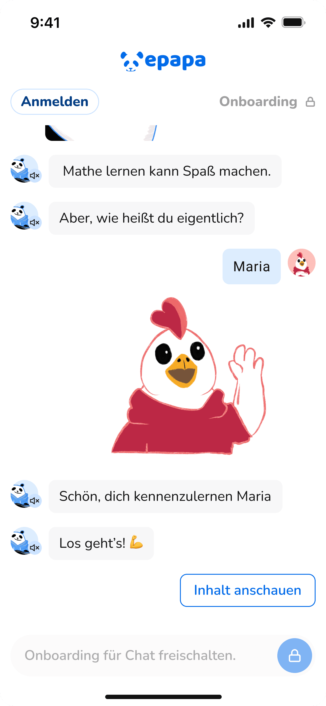

Chat prototyping
Preview of the first prototype based on the MVP created by Bonanza Studio.
Missing the use of images and exercises to keep the user's interest.
Clearer Learning Journey
User need
Help me understand where I am, what I have completed, and what I need to do next.
Design response
Redesigned the core user flow and progression structure to make the learning journey easier to follow.
UX value
Reduces uncertainty and helps students continue with less external guidance.
Visible Support Entry Point
User need
Help me when I feel stuck, without making me leave the learning flow.
Design response
Improved the visibility and placement of the support entry point in the prototype.
UX value
Makes support easier to discover while keeping students focused on the lesson.
Scope note
The prototype was not connected to a live AI system. The design work focused on visibility, placement, and understanding of the support entry point, not on testing AI-generated answers.
Audio Button Integration
User need
Help me access content in a way that fits my learning needs.
Design response
Placed the audio button directly within the relevant learning context.
UX value
Supports accessibility and helps students interact with the content more independently.
Header and Footer Redesign
User need
Help me find important actions without getting lost.
Design response
Redesigned the header and footer navigation to make key controls and support options easier to access.
UX value
Reduces cognitive load and creates a more predictable structure for young learners.
Chat prototyping
Preview of the first prototype based on the MVP created by Bonanza Studio.
Missing the use of images and exercises to keep the user's interest.
Clearer Learning Journey
User need
Help me understand where I am, what I have completed, and what I need to do next.
Design response
Redesigned the core user flow and progression structure to make the learning journey easier to follow.
UX value
Reduces uncertainty and helps students continue with less external guidance.
Visible Support Entry Point
User need
Help me when I feel stuck, without making me leave the learning flow.
Design response
Improved the visibility and placement of the support entry point in the prototype.
UX value
Makes support easier to discover while keeping students focused on the lesson.
Scope note
The prototype was not connected to a live AI system. The design work focused on visibility, placement, and understanding of the support entry point, not on testing AI-generated answers.
Audio Button Integration
User need
Help me access content in a way that fits my learning needs.
Design response
Placed the audio button directly within the relevant learning context.
UX value
Supports accessibility and helps students interact with the content more independently.
Header and Footer Redesign
User need
Help me find important actions without getting lost.
Design response
Redesigned the header and footer navigation to make key controls and support options easier to access.
UX value
Reduces cognitive load and creates a more predictable structure for young learners.
Chat prototyping
Preview of the first prototype based on the MVP created by Bonanza Studio.
Missing the use of images and exercises to keep the user's interest.
Clearer Learning Journey
User need
Help me understand where I am, what I have completed, and what I need to do next.
Design response
Redesigned the core user flow and progression structure to make the learning journey easier to follow.
UX value
Reduces uncertainty and helps students continue with less external guidance.
Visible Support Entry Point
User need
Help me when I feel stuck, without making me leave the learning flow.
Design response
Improved the visibility and placement of the support entry point in the prototype.
UX value
Makes support easier to discover while keeping students focused on the lesson.
Scope note
The prototype was not connected to a live AI system. The design work focused on visibility, placement, and understanding of the support entry point, not on testing AI-generated answers.
Audio Button Integration
User need
Help me access content in a way that fits my learning needs.
Design response
Placed the audio button directly within the relevant learning context.
UX value
Supports accessibility and helps students interact with the content more independently.
Header and Footer Redesign
User need
Help me find important actions without getting lost.
Design response
Redesigned the header and footer navigation to make key controls and support options easier to access.
UX value
Reduces cognitive load and creates a more predictable structure for young learners.
Chat prototyping
Preview of the first prototype based on the MVP created by Bonanza Studio.
Missing the use of images and exercises to keep the user's interest.
Clearer Learning Journey
User need
Help me understand where I am, what I have completed, and what I need to do next.
Design response
Redesigned the core user flow and progression structure to make the learning journey easier to follow.
UX value
Reduces uncertainty and helps students continue with less external guidance.
Visible Support Entry Point
User need
Help me when I feel stuck, without making me leave the learning flow.
Design response
Improved the visibility and placement of the support entry point in the prototype.
UX value
Makes support easier to discover while keeping students focused on the lesson.
Scope note
The prototype was not connected to a live AI system. The design work focused on visibility, placement, and understanding of the support entry point, not on testing AI-generated answers.
Audio Button Integration
User need
Help me access content in a way that fits my learning needs.
Design response
Placed the audio button directly within the relevant learning context.
UX value
Supports accessibility and helps students interact with the content more independently.
Header and Footer Redesign
User need
Help me find important actions without getting lost.
Design response
Redesigned the header and footer navigation to make key controls and support options easier to access.
UX value
Reduces cognitive load and creates a more predictable structure for young learners.
Chat prototyping
Preview of the first prototype based on the MVP created by Bonanza Studio.
Missing the use of images and exercises to keep the user's interest.
Clearer Learning Journey
User need
Help me understand where I am, what I have completed, and what I need to do next.
Design response
Redesigned the core user flow and progression structure to make the learning journey easier to follow.
UX value
Reduces uncertainty and helps students continue with less external guidance.
Visible Support Entry Point
User need
Help me when I feel stuck, without making me leave the learning flow.
Design response
Improved the visibility and placement of the support entry point in the prototype.
UX value
Makes support easier to discover while keeping students focused on the lesson.
Scope note
The prototype was not connected to a live AI system. The design work focused on visibility, placement, and understanding of the support entry point, not on testing AI-generated answers.
Audio Button Integration
User need
Help me access content in a way that fits my learning needs.
Design response
Placed the audio button directly within the relevant learning context.
UX value
Supports accessibility and helps students interact with the content more independently.
Header and Footer Redesign
User need
Help me find important actions without getting lost.
Design response
Redesigned the header and footer navigation to make key controls and support options easier to access.
UX value
Reduces cognitive load and creates a more predictable structure for young learners.
Chat prototyping
Preview of the first prototype based on the MVP created by Bonanza Studio.
Missing the use of images and exercises to keep the user's interest.
Clearer Learning Journey
User need
Help me understand where I am, what I have completed, and what I need to do next.
Design response
Redesigned the core user flow and progression structure to make the learning journey easier to follow.
UX value
Reduces uncertainty and helps students continue with less external guidance.
Visible Support Entry Point
User need
Help me when I feel stuck, without making me leave the learning flow.
Design response
Improved the visibility and placement of the support entry point in the prototype.
UX value
Makes support easier to discover while keeping students focused on the lesson.
Scope note
The prototype was not connected to a live AI system. The design work focused on visibility, placement, and understanding of the support entry point, not on testing AI-generated answers.
Audio Button Integration
User need
Help me access content in a way that fits my learning needs.
Design response
Placed the audio button directly within the relevant learning context.
UX value
Supports accessibility and helps students interact with the content more independently.
Header and Footer Redesign
User need
Help me find important actions without getting lost.
Design response
Redesigned the header and footer navigation to make key controls and support options easier to access.
UX value
Reduces cognitive load and creates a more predictable structure for young learners.
Chat prototyping
Preview of the first prototype based on the MVP created by Bonanza Studio.
Missing the use of images and exercises to keep the user's interest.
Clearer Learning Journey
User need
Help me understand where I am, what I have completed, and what I need to do next.
Design response
Redesigned the core user flow and progression structure to make the learning journey easier to follow.
UX value
Reduces uncertainty and helps students continue with less external guidance.
Visible Support Entry Point
User need
Help me when I feel stuck, without making me leave the learning flow.
Design response
Improved the visibility and placement of the support entry point in the prototype.
UX value
Makes support easier to discover while keeping students focused on the lesson.
Scope note
The prototype was not connected to a live AI system. The design work focused on visibility, placement, and understanding of the support entry point, not on testing AI-generated answers.
Audio Button Integration
User need
Help me access content in a way that fits my learning needs.
Design response
Placed the audio button directly within the relevant learning context.
UX value
Supports accessibility and helps students interact with the content more independently.
Header and Footer Redesign
User need
Help me find important actions without getting lost.
Design response
Redesigned the header and footer navigation to make key controls and support options easier to access.
UX value
Reduces cognitive load and creates a more predictable structure for young learners.
Chat prototyping
Preview of the first prototype based on the MVP created by Bonanza Studio.
Missing the use of images and exercises to keep the user's interest.

Clearer Learning Journey
User need
Help me understand where I am, what I have completed, and what I need to do next.
Design response
Redesigned the core user flow and progression structure to make the learning journey easier to follow.
UX value
Reduces uncertainty and helps students continue with less external guidance.
Visible Support Entry Point
User need
Help me when I feel stuck, without making me leave the learning flow.
Design response
Improved the visibility and placement of the support entry point in the prototype.
UX value
Makes support easier to discover while keeping students focused on the lesson.
Scope note
The prototype was not connected to a live AI system. The design work focused on visibility, placement, and understanding of the support entry point, not on testing AI-generated answers.
Audio Button Integration
User need
Help me access content in a way that fits my learning needs.
Design response
Placed the audio button directly within the relevant learning context.
UX value
Supports accessibility and helps students interact with the content more independently.
Header and Footer Redesign
User need
Help me find important actions without getting lost.
Design response
Redesigned the header and footer navigation to make key controls and support options easier to access.
UX value
Reduces cognitive load and creates a more predictable structure for young learners.
Chat prototyping
Preview of the first prototype based on the MVP created by Bonanza Studio.
Missing the use of images and exercises to keep the user's interest.
Clearer Learning Journey
User need
Help me understand where I am, what I have completed, and what I need to do next.
Design response
Redesigned the core user flow and progression structure to make the learning journey easier to follow.
UX value
Reduces uncertainty and helps students continue with less external guidance.
Visible Support Entry Point
User need
Help me when I feel stuck, without making me leave the learning flow.
Design response
Improved the visibility and placement of the support entry point in the prototype.
UX value
Makes support easier to discover while keeping students focused on the lesson.
Scope note
The prototype was not connected to a live AI system. The design work focused on visibility, placement, and understanding of the support entry point, not on testing AI-generated answers.
Audio Button Integration
User need
Help me access content in a way that fits my learning needs.
Design response
Placed the audio button directly within the relevant learning context.
UX value
Supports accessibility and helps students interact with the content more independently.
Header and Footer Redesign
User need
Help me find important actions without getting lost.
Design response
Redesigned the header and footer navigation to make key controls and support options easier to access.
UX value
Reduces cognitive load and creates a more predictable structure for young learners.
Chat prototyping
Preview of the first prototype based on the MVP created by Bonanza Studio.
Missing the use of images and exercises to keep the user's interest.
Clearer Learning Journey
User need
Help me understand where I am, what I have completed, and what I need to do next.
Design response
Redesigned the core user flow and progression structure to make the learning journey easier to follow.
UX value
Reduces uncertainty and helps students continue with less external guidance.
Visible Support Entry Point
User need
Help me when I feel stuck, without making me leave the learning flow.
Design response
Improved the visibility and placement of the support entry point in the prototype.
UX value
Makes support easier to discover while keeping students focused on the lesson.
Scope note
The prototype was not connected to a live AI system. The design work focused on visibility, placement, and understanding of the support entry point, not on testing AI-generated answers.
Audio Button Integration
User need
Help me access content in a way that fits my learning needs.
Design response
Placed the audio button directly within the relevant learning context.
UX value
Supports accessibility and helps students interact with the content more independently.
Header and Footer Redesign
User need
Help me find important actions without getting lost.
Design response
Redesigned the header and footer navigation to make key controls and support options easier to access.
UX value
Reduces cognitive load and creates a more predictable structure for young learners.
Chat prototyping
Preview of the first prototype based on the MVP created by Bonanza Studio.
Missing the use of images and exercises to keep the user's interest.
Clearer Learning Journey
User need
Help me understand where I am, what I have completed, and what I need to do next.
Design response
Redesigned the core user flow and progression structure to make the learning journey easier to follow.
UX value
Reduces uncertainty and helps students continue with less external guidance.
Visible Support Entry Point
User need
Help me when I feel stuck, without making me leave the learning flow.
Design response
Improved the visibility and placement of the support entry point in the prototype.
UX value
Makes support easier to discover while keeping students focused on the lesson.
Scope note
The prototype was not connected to a live AI system. The design work focused on visibility, placement, and understanding of the support entry point, not on testing AI-generated answers.
Audio Button Integration
User need
Help me access content in a way that fits my learning needs.
Design response
Placed the audio button directly within the relevant learning context.
UX value
Supports accessibility and helps students interact with the content more independently.
Header and Footer Redesign
User need
Help me find important actions without getting lost.
Design response
Redesigned the header and footer navigation to make key controls and support options easier to access.
UX value
Reduces cognitive load and creates a more predictable structure for young learners.
Chat prototyping
Preview of the first prototype based on the MVP created by Bonanza Studio.
Missing the use of images and exercises to keep the user's interest.
Testing
Testing the Prototype Experience
The usability testing focused on whether students could understand the redesigned prototype, navigate the learning flow, identify key actions, and recognize where support would be available.
Because the prototype was not connected to a live AI system, testing did not evaluate the quality or accuracy of AI-generated answers. Instead, it focused on usability, clarity, accessibility, and discoverability.
What Was Tested
Learning flow understanding
Navigation clarity
Visibility of progress and next steps
Support entry point discoverability
Accessibility-related interaction patterns
Ease of use of the prototype


results
From Usability Risk to a Clearer Learning Experience
The final design improvements helped transform the MVP from a concept-driven prototype into a clearer and more structured learning experience. understand and follow.
Clearer learning flow
The redesigned structure helped make the learning journey easier to understand and follow.
Clearer learning flow
The redesigned structure helped make the learning journey easier to understand and follow.
Stronger accessibility support
Audio access, clearer hierarchy, and simplified interaction patterns supported a more inclusive learning experience.
Business Challenge
Stronger accessibility support
Audio access, clearer hierarchy, and simplified interaction patterns supported a more inclusive learning experience.
Business Challenge

Improved support discoverability
The support entry point became more visible and easier to identify within the prototype.
Business Challenge
Improved support discoverability
The support entry point became more visible and easier to identify within the prototype.
Business Challenge

Better navigation structure
Header and footer improvements made key actions and settings easier to access.
Better navigation structure
Header and footer improvements made key actions and settings easier to access.

Development-ready UI
Final screens and detailed designs were prepared in Figma for developer implementation.
Development-ready UI
Final screens and detailed designs were prepared in Figma for developer implementation.
Development-ready UI
Final screens and detailed designs were prepared in Figma for developer implementation.
future work
Success Metrics for Future Iterations
Task Completion Rate: Can students complete the learning flow independently?
Student Confidence Score: Do students feel oriented and supported during the experience?
Support Entry Point Discoverability: Can students find where to get help?
Accessibility Issues Found: Are there barriers related to readability, navigation, audio, or interaction?
Engagement During Session: Do students stay active and motivated during the prototype experience?
Let’s connect! Whether you have a new project in mind or just want to chat about design, creativity, or anything in between, you can reach me at errazuriz.francisca@gmail.com.
I'm also on LinkedIn, always happy to meet new people!
© Framer Inc. 2026